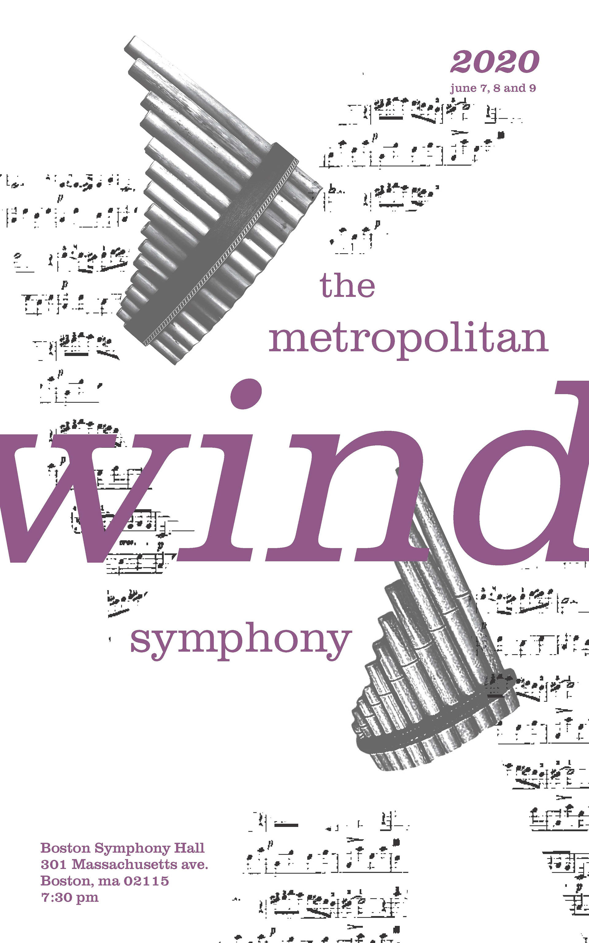
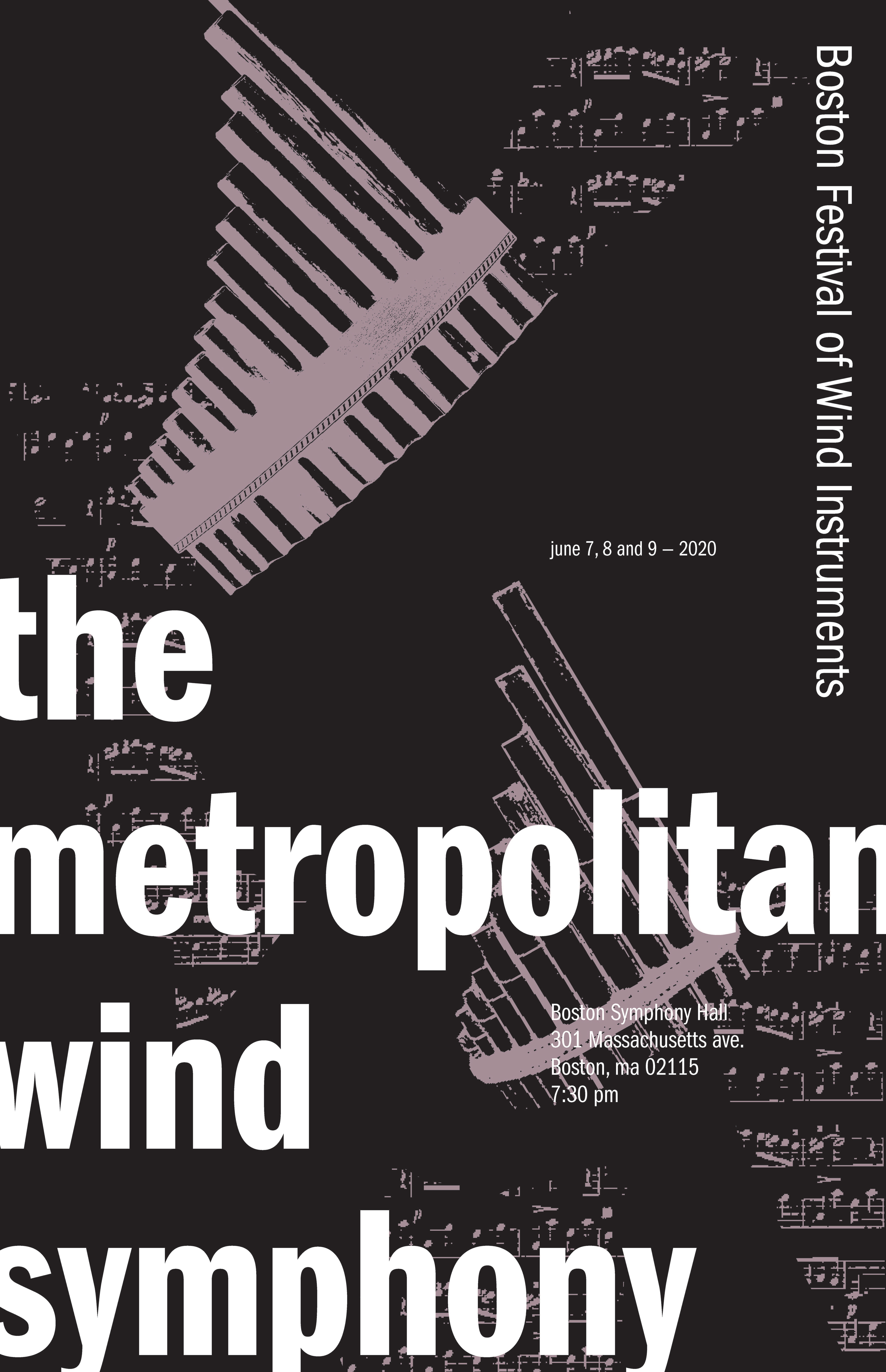
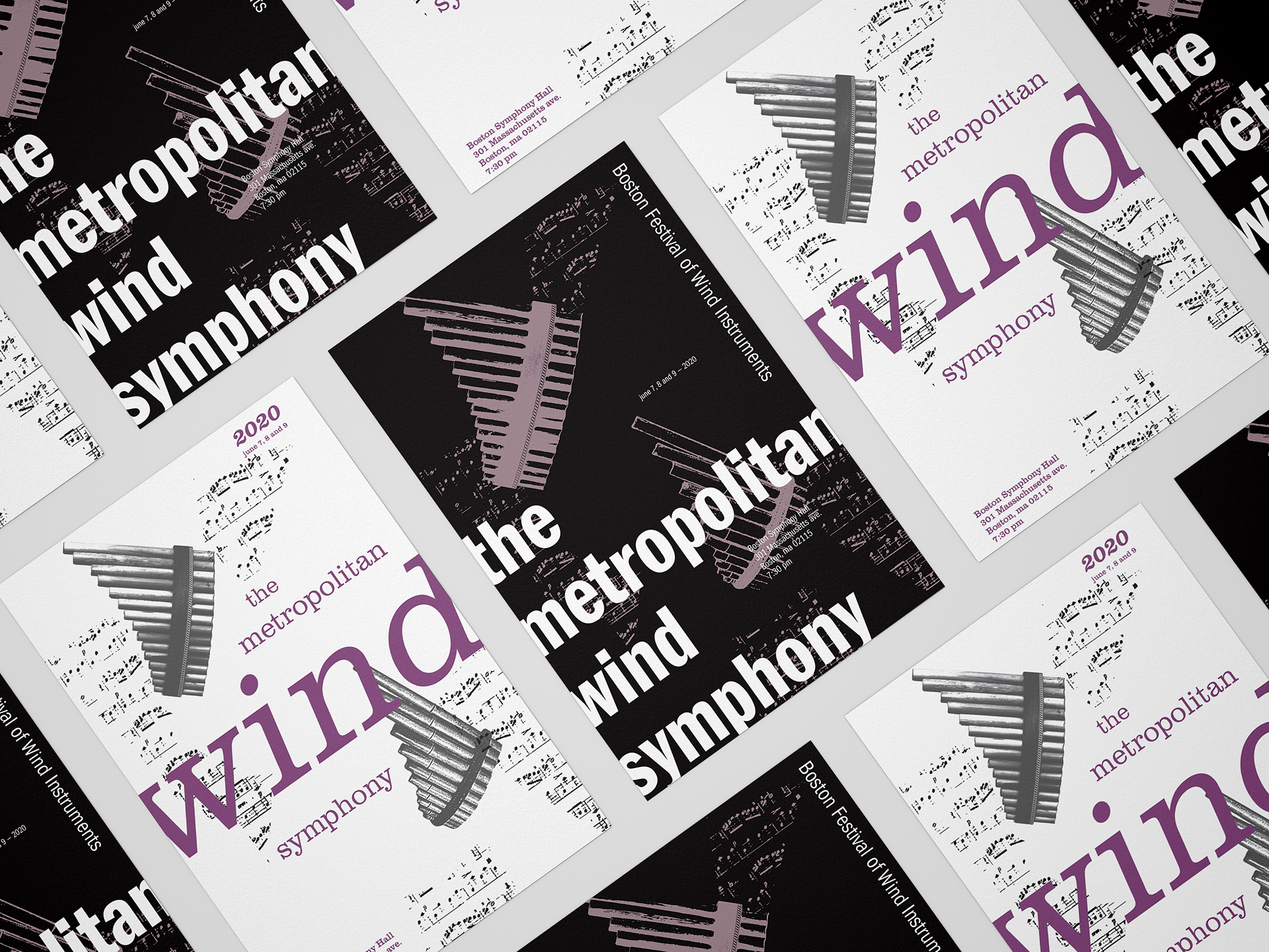
These are two iterations of the same wind symphony poster. For both of them, I wanted to communicate a flowing sensation to the viewer, which I tried to achieve with the different musical instruments and faded musical notes placed in different spots of the page as if they are following different wind currents. I also wanted to connect or contrast the type families with the elements placed throughout the pages. For instance, the poster with white background uses the Clarendon type family, due to their bold solid structure that creates a compelling contrast with the thinner and faded chunks of musical notations throughout the page. The poster with black background uses a Franklin Gothic type family that possesses more organic features, and such organic features can also be seen in the pipe flutes placed on the page.